1 min to read
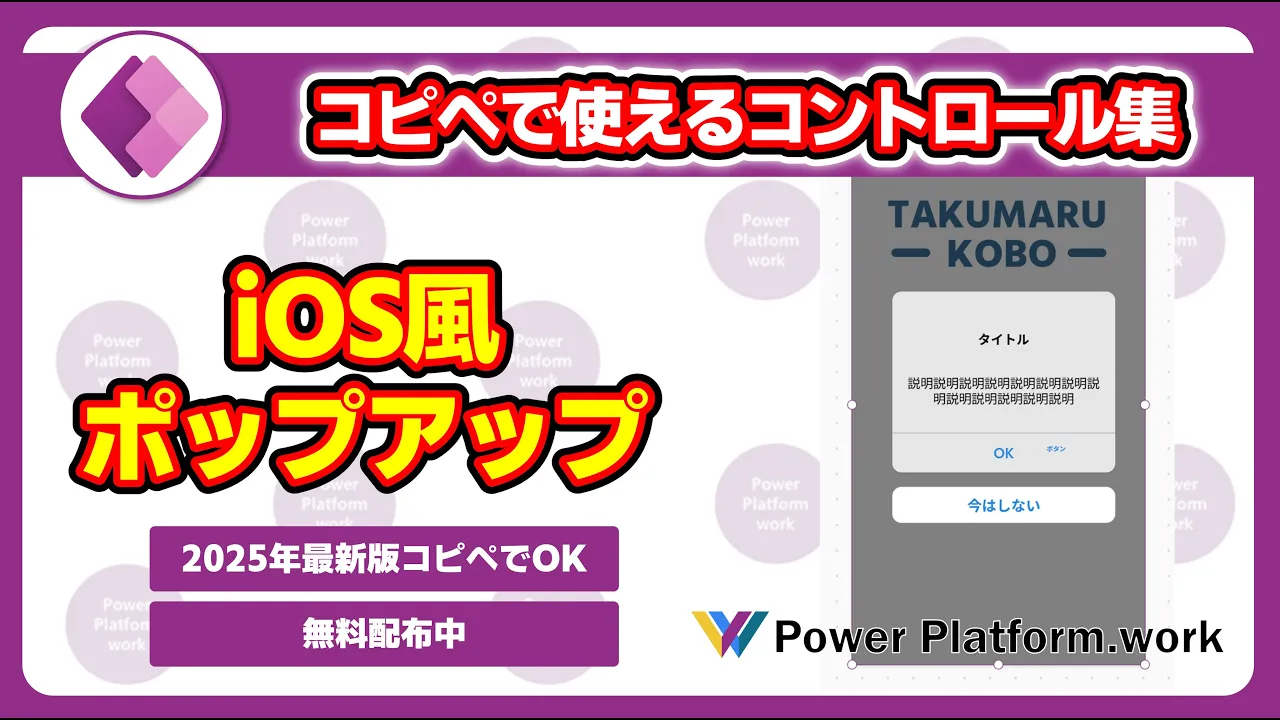
Power Apps で コピペで使えるiOS 風のポップアップ(モーダル)を作成【2025年バージョン】 コードも無料配布中
概要
そのままコピペで利用できる iOS 風ポップアップのデザインです。
本コードの使用に関しては、いかなる責任も負いかねますので、あらかじめご了承ください。
YAMLコード
- Container3:
    Control: GroupContainer@1.3.0
    Variant: ManualLayout
    Properties:
      DropShadow: =DropShadow.None
      Fill: =RGBA(0, 0, 0, 0.5)
      Height: =1136
      RadiusBottomLeft: =0
      RadiusBottomRight: =0
      RadiusTopLeft: =0
      RadiusTopRight: =0
      Width: =640
    Children:
      - Container4:
          Control: GroupContainer@1.3.0
          Variant: ManualLayout
          Properties:
            Fill: =RGBA(255, 255, 255, 0.8)
            Height: =396
            RadiusBottomLeft: =20
            RadiusBottomRight: =20
            RadiusTopLeft: =20
            RadiusTopRight: =20
            Width: =487
            X: =88
            Y: =320
          Children:
            - Label5:
                Control: Label@2.5.1
                Properties:
                  Align: =Align.Center
                  FontWeight: =FontWeight.Bold
                  Height: =99
                  Text: ="タイトル"
                  Width: =434
                  X: =26
                  Y: =54
            - Label5_1:
                Control: Label@2.5.1
                Properties:
                  Align: =Align.Center
                  Height: =126
                  Text: ="説明説明説明説明説明説明説明説明説明説明説明説明説明"
                  Width: =434
                  X: =26
                  Y: =154
            - Rectangle1:
                Control: Rectangle@2.3.0
                Properties:
                  Fill: =RGBA(122, 138, 143, 1)
                  Height: =1
                  Width: =487
                  Y: =309
            - Button3:
                Control: Classic/Button@2.2.0
                Properties:
                  BorderStyle: =BorderStyle.None
                  Color: =RGBA(40, 134, 222, 1)
                  Fill: =RGBA(0, 0, 0, 0)
                  Height: =82
                  HoverColor: =Self.Color
                  HoverFill: =Self.Fill
                  PressedFill: =Self.Fill
                  Text: ="OK"
                  Width: =434
                  X: =26
                  Y: =310
      - Button3_1:
          Control: Classic/Button@2.2.0
          Properties:
            BorderStyle: =BorderStyle.None
            Color: =RGBA(40, 134, 222, 1)
            Fill: =RGBA(255, 255, 255, 1)
            Height: =79
            HoverColor: =Self.Color
            HoverFill: =Self.Fill
            PressedFill: =Self.Fill
            RadiusBottomLeft: =20
            RadiusBottomRight: =20
            RadiusTopLeft: =20
            RadiusTopRight: =20
            Text: ="今はしない"
            Width: =487
            X: =88
            Y: =747
使用した式は動画の概要欄をご確認ください

Comments